Wood can make a light fixture feel warm, calm, or visually heavy. Yet two finishes labeled “walnut” may look quite different beside each other. Grain, stain, age, and room lighting all affect how their colors appear. A honey-toned oak pendant might glow beside pale flooring, but turn orange near cool gray cabinets. Small differences matter.
Learning how to match different wood finishes in lighting starts with comparing undertones, not just names. Look at each piece in daylight and after dark, when bulbs can shift its appearance. Hold finish samples beside the fixture, flooring, and nearby furniture. Check the grain, too: a smooth, even finish can feel formal beside rustic, open grain. These are practical checks, not guarantees. Wood varies, and a sample may not represent a finished fixture perfectly.
This guide explores seven useful ways to create a considered mix, from repeating one wood tone to balancing contrast with metal or glass. You’ll also find advice on scale, finish sheen, and choosing the right light color. There is no single formula. Sometimes a pairing seems right in a showroom but feels too busy at home. Give the combination time, and be willing to reconsider it.
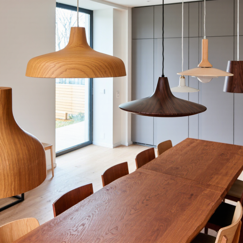
Identify the Wood Species, Tone, and Finish in Each Lighting Fixture
Matching wood finishes starts with identifying what each lighting fixture is made from. Look closely at the grain near the canopy, stem, or base, where details are easier to see. Oak often shows open, distinct grain; ash can look lighter and more linear. Walnut commonly has deeper brown tones, though its color varies. These clues are useful, not proof. A fixture may use veneer, stained wood, or a mix of materials. Check product specifications when available, and avoid judging species from one small area alone.
Next, compare the wood’s underlying tone. One piece may lean golden, while another has a reddish or cool gray cast. Hold fixtures together in daylight if possible, then check them under the room’s usual bulbs. Warm light can make two different finishes seem closer than they are. That can be misleading. A phone photo may help, but screens shift color, so treat it as a rough reference rather than a final test.
Finish matters as much as species and tone. A matte surface scatters light softly; satin or gloss can create brighter reflections. Notice whether the grain feels smooth, brushed, or slightly textured. If you can, place a finish sample beside the fixture and view both from the doorway, not just up close. I’ve found this catches mismatches that seemed harmless on a workbench. Still, perfect coordination can look too uniform; a small, deliberate contrast may feel more natural.
Compare Undertones, Grain Patterns, and Sheen
Matching wood finishes in lighting starts with undertones, not exact color.
A pale oak fixture may look yellow beside a gray-brown floor, even when both seem neutral. Compare samples next to the room’s main wood surfaces, then check them in daylight and with the intended bulbs switched on. Do this at night, too. Warm light can make reddish undertones more noticeable, while cooler light may flatten them.
Grain matters as much as color.
A fixture with bold, widely spaced grain can compete with a heavily figured table, even if their stains are close. Pair busy grain with a calmer surface, or repeat a similar grain direction to create a more deliberate connection. Look at full-size samples when possible; small chips can hide knots and strong grain shifts. Not identical.
Sheen changes how wood reads under a lamp.
Glossy finishes reflect bright points, while matte finishes soften them and usually show less glare. Place samples where the fixture will hang, and view them from seated and standing positions. A finish that looks coordinated from above may feel too shiny at eye level. There is no perfect match in every room, and judging samples under only one light source is an easy mistake.
Repeat Similar Finishes for a Cohesive Look
Repeat similar wood finishes across a room, but avoid making every piece identical. A walnut-toned pendant can echo the warmth of a console or cabinet, while differences in grain keep the space from feeling staged. Check undertones in daylight and after dark. A finish that looks honey-colored beside a window may appear orange under a warm bulb. Small samples help. Hold them near the fixture, floor, and furniture before deciding.
The 2024 U.S. Houzz & Home Study reported a median home-renovation spend of $24,000 for projects completed in 2023. That figure covers renovations broadly, not lighting alone, but it shows why finish choices deserve care. Repeating a wood tone can make separate purchases feel intentional without requiring a matching set. Try echoing it in two or three places, such as a lamp base, shelf, and cabinet detail. Too much repetition can flatten a room. I sometimes find that the “perfect” match looks less natural once everything is installed; a related tone, with a little contrast, often feels more lived-in.
| 7 Best Ways to Match Wood Finishes in Lighting - Repeat Similar Finishes for a Cohesive Look |
| No. |
Matching Approach |
Wood Finish Pairing |
Lighting Application |
Practical Tip |
| 1 |
Repeat a similar wood tone |
Light oak with light oak, or walnut with walnut |
Use a wood-finished pendant near a dining table or cabinetry in a similar tone. |
Compare samples in the room’s actual lighting; wood can look different under warm or cool bulbs. |
| 2 |
Match the undertone |
Warm honey-toned woods with other warm finishes; cooler, muted woods with cooler finishes |
Coordinate a lamp base or ceiling-light detail with nearby furniture or flooring. |
Look for yellow, red, or gray undertones rather than relying only on how light or dark a finish appears. |
| 3 |
Use a consistent finish character |
Matte with matte, or a similarly low-sheen finish |
Pair a matte wood fixture with a matte-finished table or built-in shelving. |
Consistent sheen helps different wood species feel more related, even when their colors are not identical. |
| 4 |
Repeat the finish in more than one place |
Echo one wood finish in two or more room elements |
Repeat a pendant’s wood detail in a side table, picture frame, or cabinet hardware surround. |
Small, deliberate repetitions make a finish feel intentional without requiring every wood surface to match. |
| 5 |
Coordinate grain scale and direction |
Pair similarly subtle or similarly pronounced grain patterns |
Consider grain visibility when placing a wooden lamp beside a prominent tabletop or floor. |
When grain patterns differ, use a simpler fixture shape or place a neutral material between the pieces. |
| 6 |
Create contrast with a clear plan |
Light wood against dark wood, with a shared undertone or repeated detail |
Use a contrasting wood lamp as an accent against a darker desk or lighter console. |
Keep the contrast purposeful and repeat one of the tones elsewhere so the fixture does not feel isolated. |
| 7 |
Balance wood with neutral materials |
Wood paired with linen, glass, ceramic, or metal |
Choose a fixture with a wood element and a neutral shade or simple glass diffuser. |
Neutral materials provide visual space between different wood finishes and help the overall palette feel cohesive. |
Use Contrast and Complementary Tones with Care
A successful lighting scheme does not require every wood surface to share the same finish. A little contrast can make a room feel collected rather than showroom-perfect. Pair a pale oak table with a walnut lamp base, for example, but look for a shared undertone. Warm, honey-colored wood usually sits comfortably beside other warm finishes. Cool, gray-brown timber can make golden wood look unexpectedly orange.
Check samples in the actual room. Daylight and warm bulbs can shift a finish’s appearance, sometimes more than expected. Hold a wood sample beside the lamp, then view both at night. Notice the grain, too: a bold, striped pattern may compete with another busy surface, even when the colors agree. Keep one finish quieter. That helps.
Contrast can also come from texture. A matte wood base beside a polished side table creates variation without adding another strong color. Still, matching undertones is not a perfect science; stains age, and screens can mislead. I would avoid choosing from a tiny online swatch alone. Bring a larger sample home, place it near the fixture, and check it from the doorway as well as up close. A combination that looks pleasing in a shop may feel too heavy beside a dark floor.
Check Wood Finish Pairings in the Room’s Lighting and Materials
A wood finish can look honey-gold beside a warm lamp, then turn gray under a cooler one. The U.S. Department of Energy groups warm-white lighting around 2700–3000 K and cooler white around 3500–4100 K. Test your fixture choice at night, not just beside a showroom window. Set a wood sample near the floor, wall paint, and metal hardware. Check it under the actual bulb. Small shifts matter.
The Illuminating Engineering Society’s TM-30 method measures color fidelity (Rf) and gamut (Rg), offering more detail than a single CRI score. Ask for these values when comparing lamps, but judge the real room too: a strong red oak grain may appear more orange beside a warm bulb, while walnut can lose depth under a cool one. I still misjudge this sometimes. Try samples at several angles, then view them from the doorway. Glossy tile, pale stone, and dark upholstery all bounce light differently. A satin finish may blend beside matte cabinetry, yet look mismatched beside polished brass. Don’t force every wood tone to match. A deliberate contrast often feels calmer than a near-match that shifts under evening light.
Conclusion
Matching wood finishes in lighting starts with identifying the wood species, color tone, and surface finish of each fixture. Compare warm or cool undertones, grain patterns, and sheen rather than relying on color alone. Two woods can look harmonious even when their shades differ, provided their underlying tones and textures relate well. Repeating a similar finish in more than one fixture can create a sense of unity, while subtle variations help keep the room from feeling overly uniform.
For a more layered look, pair contrasting or complementary tones thoughtfully, making sure no single finish feels disconnected from the rest of the space. View the fixtures under the room’s actual lighting, since daylight and artificial light can change how wood appears. Also consider nearby furniture, flooring, and other materials. These steps offer a practical guide to how to match different wood finishes in lighting and create a balanced, cohesive interior.

 PureRay Light